
Aarrya Saraf (based on an online MIT course lecture here).
If you’re reading this, chances are you love maths but are likely struggling to find others who love a good proof as much as you do. I too, find myself in this same predicament, which has led me to think: what actually appeals to teenagers? Cursory research and an unreliable survey later, I have two answers: candy, and sex. Since I’d rather keep all the secrets about candy to myself, here’s some maths about sexual promiscuity instead.
The question I will answer today is age-old: on average, do males or females have more partners of the opposite gender and, if so, by what percent? To clarify, I am not making any moral judgments here, I’m purely concerned with the maths (because of course you can’t argue with the numbers).
So, what’s your stance? Do you think men have more partners? Or is it women? Or are they equal? Is there a way to figure it out? Of course there is, otherwise what am I even doing here…
A little research tells me that it is almost universally believed that men have significantly more partners than women, and in fact several “scientific studies” have been conducted to try to find the definitive answer.
From MIT: Researchers at the University of Chicago followed 2500 randomly-selected people over several years and published a 700-page book, called “The Soul of Social Organization of Sexuality: Sexual Practices in the US”, in which they concluded that men have 74% more partners. However, ABC News disagrees. They conducted a poll of 1,500 people in the country, in 2004, and concluded that the average disparity is much greater. Their survey revealed that the average man has 20 partners, while the average woman has 6, giving a disparity of 233%. ABC News claimed this to be “extremely scientific” and that they were within a 2.5% margin of error. Their study is called the “American Sex Survey, a Peek Between the Sheets”.
Both studies did not specify that partners must be of the opposite sex, but even so their conclusions seem to be highly unlikely when we crunch the numbers…
Even though interviewing people might be the social scientists’ raison d’etre, a brief introduction to graph theory reveals a far simpler way to answer this question. While graph theory may instinctively conjure up images of sheets of paper with grid lines and x- and y-axes, you’d be wrong to think they are related. Informally defined, graph theory is simply a collection of circles (or nodes) connected by lines (or edges), that follow a set of rules.
What is most important for our solution to our sexual partner conundrum is to note that the number of edges connected to a node is known as the degree of the node.
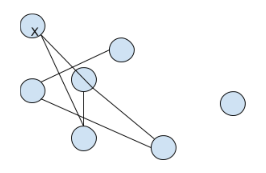
In Figure 1:We have 7 nodes.
The total edges are 5. This is written as |E|.
It’s okay to have a node with no edge connected, as seen in the right of Figure 1. We can also label the nodes; so the uppermost node can be called X.
The degree of node X would be 2 because it has 2 edges arising from it.
You can think of graph theory as just providing us with a simple visual way of representing lots of (possibly related) information for convenient organisation and analysis. A simple example to grasp this concept would be to imagine the nodes as cities and the edges as roads connecting those cities.
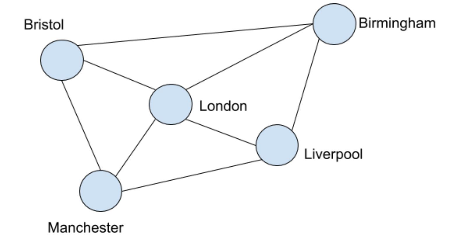
The total number of edges in Figure 2 is 8. London has a degree of 4 here since it has 4 edges (or roads) connecting it to each of the other 4 cites. All the other cities have a degree of 3 as they are connected to only three others (London and two neighbours).
So now that we have the fundamentals of graph theory on our side, how do we tackle our original problem? Here’s how it works…
Let each node represent a person. On one side we have men and on the other women, each individual represented by a node. An edge between them represents a sexual relation. As we are only considering relations with the opposite sex for simplicity, nodes between two people of the same sex are not taken into account and thus are omitted from our analysis.
As exact data isn’t at our fingertips, let’s make some educated approximations. Google says there are 7.8 billion people on earth right now so let’s round that up to 8 billion. Eliminating the 25% of the population that is under the age of 14, we are left with 6 billion people to consider as having potentially been sexually active. Next, the human sex ratio is about 101 men to every 100 women. That means that there are about 3.009 billion men and about 2.991 billion women.
Now how do we turn this into a graph theory problem? Each person can be represented by a node, and the edges represent a sexual relationship between a man and a woman. So, what we need to determine is the average degree of the male nodes and the female nodes.
Put simply, the average degree of the male nodes represents the total number of relations that men have had with different women divided by the total number of men. For example, if there were 12 men and 36 relations, the average degree would be:
36/12 = 3.
Now let Nm represent the average degree of the male nodes, and Nw the average degree of the female nodes.
We want to find Nm/Nw, which according to the UChicago researchers, is 1.74 and from ABC News is 3.33.
The graph below should help us to demonstrate the mathematical truth.
 In the figure above:
- Transparent nodes signify women
- Blue nodes signify men
- Edges represent sexual relations between a man and a woman
As an example, we can see that John has had relations with Kate, Emily, and woman #3 so his degree is 3.
Jake is asexual and has a degree of 0.
We can keep on plotting nodes representing each person and its degree the number of relations they have had.
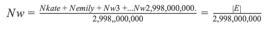
Now, as discussed above, |E| represents the total number of relations, and to get the average degree we add the degrees of the nodes under consideration and then divide by the number of nodes.
So the average degree for the male nodes is given by
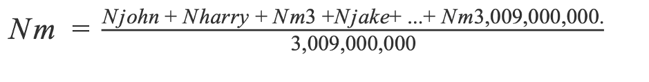 Where Nm3 represents the degree or relations of the third man and so on.
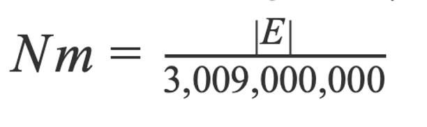
Upon further observation, we see that the numerator on the right-hand side is simply the sum total of all the edges, |E|, and so
In the same way, the average degree of women is just
 And now, we can find Nm/Nw:
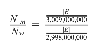
Both the |E|’s cancel out and we have 3,009,000,000/2,998,000,000 which is approximately 0.994.
Completely different to what the UChicago researchers and ABC News discovered from their studies, right? Whilst it is possible that the discrepancies can be accounted for by same sex partners, it seems unlikely given the large difference in the ratios (1.74 and 3.33 versus 0.994). By simplifying the problem and considering only partners of the opposite gender, we are able to get a reasonable approximation to the answer which we can use as a tool to evaluate the reliability of a study. The key idea here is that for every relationship a man has with a different woman, a woman has a relationship with a different man. And so, if there are fewer women on Earth, they’re going to have more partners on average.
The problem with studies based on surveys is reliability: respondents may lie, there may be selection bias or the sample size may not be large enough for the results to apply to a population as large as the national or global population. However, in studies such as these, simple mathematics could have saved a lot of time and money.
If we dig deeper, we can find endless studies that ignore mathematics and logic in favour of spurious surveys. In fact, a few years ago, the Boston Globe ran an “explosive” story about the study habits of students on Boston-area campuses. Their surveys showed that, on average, minority students tended to study with non-minority students more often than the other way around. The article featured interviews with several administrators and policymakers as to why this might be true.
However, if we take a step back and wonder why it has to be true, and not at all surprising that minority students would study alongside non-minority students in college classrooms more often than the non-minority students would find themselves studying alongside students belonging to minorities…. Because being a minority already implies that they are smaller in numbers.
So, next time you consider embarking on a ground-breaking social experiment, take the time to first ‘do the math’ and you might just save yourself a lot of time and effort. Oh, and don’t trust anyone when it comes to revealing their number of sexual partners…
Photo by Dainis Graveris on SexualAlpha

At birth, there might be 101 men for every 100 women… but women live a few years longer that males on average! So, there should be more women than men on Earth?
LikeLike