
We saw last time how to truly evaluate the performance of a test for a disease, using several different parameters – not just ‘accuracy’ which seems to be the only one that pops up in the news! Our discussion ended by saying that ideally we want to strike a balance between specificity and sensitivity, and in order to do this we use a slightly more advanced tool called an ROC curve.
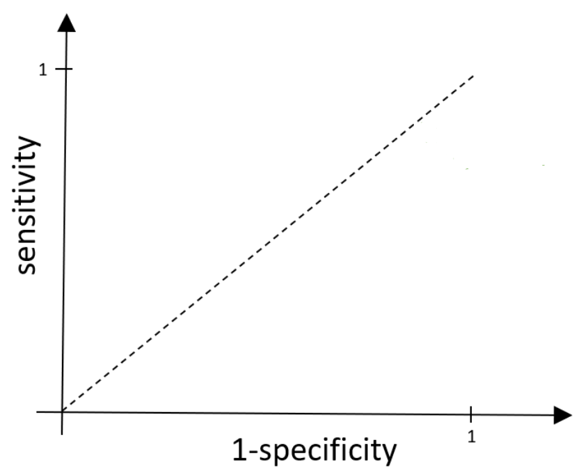
For an ROC curve, we plot 1 – specificity against sensitivity. Above we have 1 – specificity along the x-axis and sensitivity on the y-axis. Since both sensitivity and specificity (and so 1-specificity) represent proportions, they must sit in the range between 0 and 1, and so our x and y axes range between 0 and 1.
As a quick recap, specificity tells us the true negative rate, i.e. the proportion of those without the disease that receive a negative (and therefore correct) result from the test. This means 1 – specificity is the false positive rate (FPR), the proportion of those without the disease that receive an (incorrect) positive result. Sensitivity measures the true positive rate (TPR), the proportion of those with the disease that receive a positive result.
Now, most tests will output some sort of value rather than a distinct positive/negative result. It’s up to us to decide what the cut off point of the test, called the threshold, will be. This is the point at which if someone measures below the threshold, they are given a negative result and anyone that measures above the threshold gets a positive result. As the threshold is varied, both the sensitivity and specificity will vary.
To see this, let’s look at ‘dessert disease’ again – the made-up infection that turns you into a sponge cake. Imagine we can measure your sugar level, which is on a scale from 1-10. We expect people with ‘dessert disease’ to be more sugary and so need to decide which sugar level is going to be our threshold. If we put the threshold really high (close to 10), then very few results would measure higher than this, so most people will not receive a positive result. Our false positive and true positive rates will both be low, so both the x (1-specificity) and y (sensitivity) values will be small. We could of course also lower our threshold, moving it all the way down until it’s close to 1. Now, as our cut-off point is lowered, the number of people measuring above that level will increase, so we will get more positive results, and therefore higher false positive and true positive rates. As a result we see our x (1-specificity) and y (sensitivity) values both increase. And so, sensitivity and 1-specificity will indeed vary as the threshold is moved.
Here’s an example of a general ROC curve:
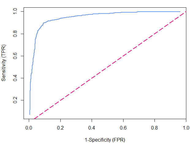
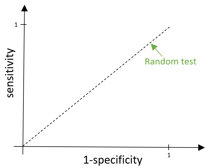
The blue line is our actual ROC curve and the pink dashed line represents what we call a ‘random test’, which gives out negative and positive results completely at random. In this case, those with the disease and those without the disease are just as likely to be given a positive result, meaning that the false positive rate and true positive rate would be equal and so it is represented by the line y=x.
For ‘dessert disease’, this would mean measuring the sugar levels, then completely ignoring them and giving out positive or negative results randomly. Obviously, this isn’t very helpful…
We want any test that we create to be better than this (pretty rubbish) random test, and so we want the ROC curve to sit above this dashed line. Sitting above the line means we have a higher true positive rate than false positive rate, so more of the positive results that are given out are correct rather than incorrect.
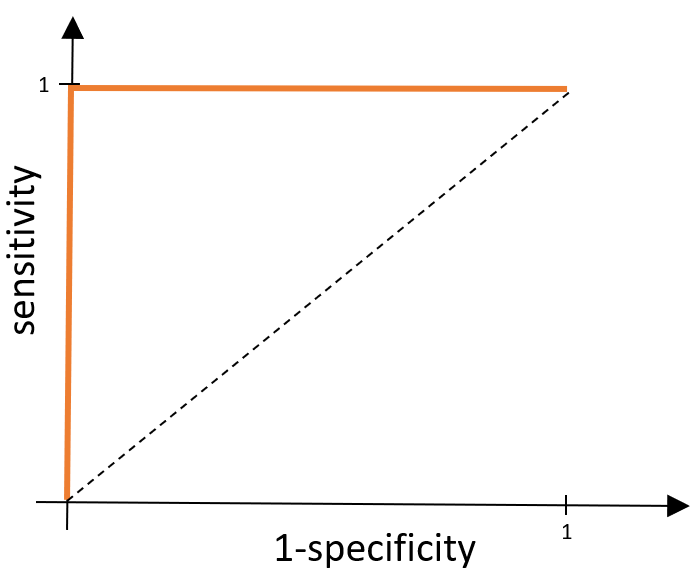
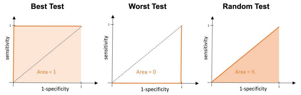
Ideally, we want our test to be perfect – so what would an ROC curve look like if our test was exactly that? A perfect test classifies all positives as positive results and all negative results as negative results. This means, wherever we place the cut off point, we would have a false positive rate of 0 and a true positive rate of 1. This means our x value would be fixed at 0 and y value would be fixed at 1, and so our ROC curve would be made up of the lines x=0 and y=1 as shown below.
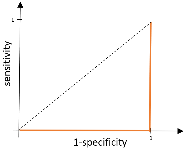
What about the worst possible test? Well, this would be the opposite of what we’ve just described above. Everyone without the disease would get a positive result and everyone with the disease would receive a negative result, meaning overall everyone gets an incorrect result. We would have a false positive rate of 1 (so we have the line x=1) and we would have a true positive rate equal to 0 (so we also have the line y=0).
These examples are pretty extreme and are very unlikely to happen. In general, we will be trying to compare tests that have ROC curves which look something like this:
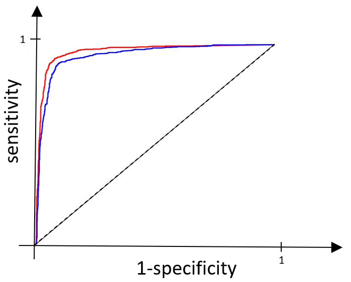
If you look closely, you can see that the test represented by the red line is slightly closer to the ROC curve for our perfect test than the blue one, and so we would like to say it is the ‘better test’. You might not be very happy with this, and you’re right not to be – we want to make this comparison far more precise. We do this by comparing the area under each of the ROC curves. The area under the curve (AUC) tells us the probability that the test will classify a randomly drawn person with the disease, as having the disease, rather than classifying someone without the disease as having it.
If we think back to our perfect test, we would have an area under the curve of 1 – this is the maximum AUC value. Our worst possible test would have an area of zero – the minimum AUC value. For our random test the area would be ½.
A higher AUC value indicates a better test and so when we compare tests, we want to choose the one with the highest AUC value.
For our red and blue curves above, the AUC for the test represented by the blue line is 0.947 and for the red line the AUC is 0.967. Clearly, 0.967 is the bigger value and so we see that the red test is indeed the better one. These calculations are exactly the ones used in practice when comparing different disease tests to determine which ones we should – and shouldn’t – be using.
So, next time you see the word ‘accuracy’ being used to evaluate the performance a disease test, remember this is just the tip of the iceberg. We need the sensitivity, specificity and ultimately the AUC value before drawing any conclusions!
