
Aidan Strong
Ever looked at a map of the world? Well you probably have, but it turns out that every map you have ever seen is a lie. That’s right. Is there some global conspiracy amongst cartographers to prevent correct maps from reaching the public?! Probably not, as in fact the reason turns out to be a fundamental problem of geometry…
Let’s start with a definition. An isometry is a transformation which preserves the distances between all points – so if A is transformed to A’ , and B is transformed to B’, then the distance AB is equal to the distance A’B’. So for example, rotations, reflections, and translations are all isometries, but stretches and enlargements are not. Equivalently, an isometry is a transformation that preserves the areas of shapes, and the angles between any two crossing curves. Now, one would hope if you’re deciding to make a map of the world, that it would preserve both of these things – you’d at the very least want countries to have the right size and shape, right?
However, in 1827, the mathematician Carl Friedrich Gauss proved that this is impossible! Gauss proved that surfaces, such as spheres, have an intrinsic property – appropriately called Gaussian curvature – which is preserved under any isometry. Since a flat surface has 0 Gaussian curvature, and a sphere has positive Gaussian curvature, this means that it’s impossible for there to be an isometry between the two.
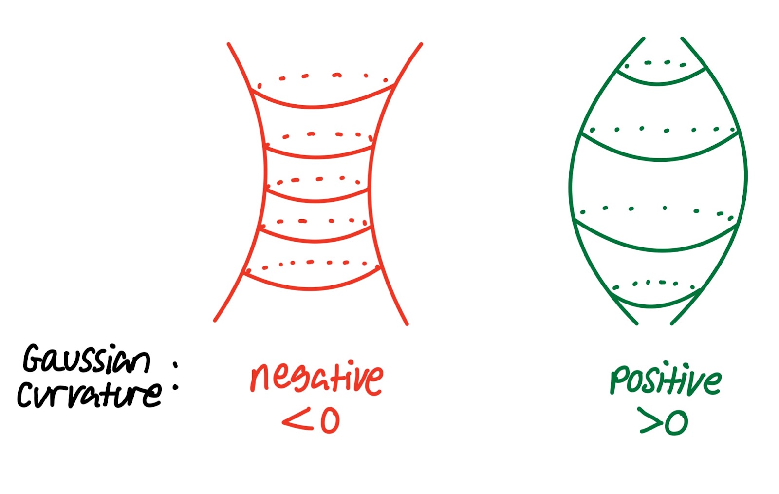
If all this maths jargon is confusing, don’t worry – just take a flat piece of paper, place it on your head, and try to wrap it around the top of your head without the paper creasing or tearing. Impossible? Well according to Gauss it must be – your head has positive Gaussian curvature, while the flat paper has 0 Gaussian curvature, so there’s no isometry between them! All of this means that any world map must have some distortion, and therefore has to compromise between preserving areas or angles.
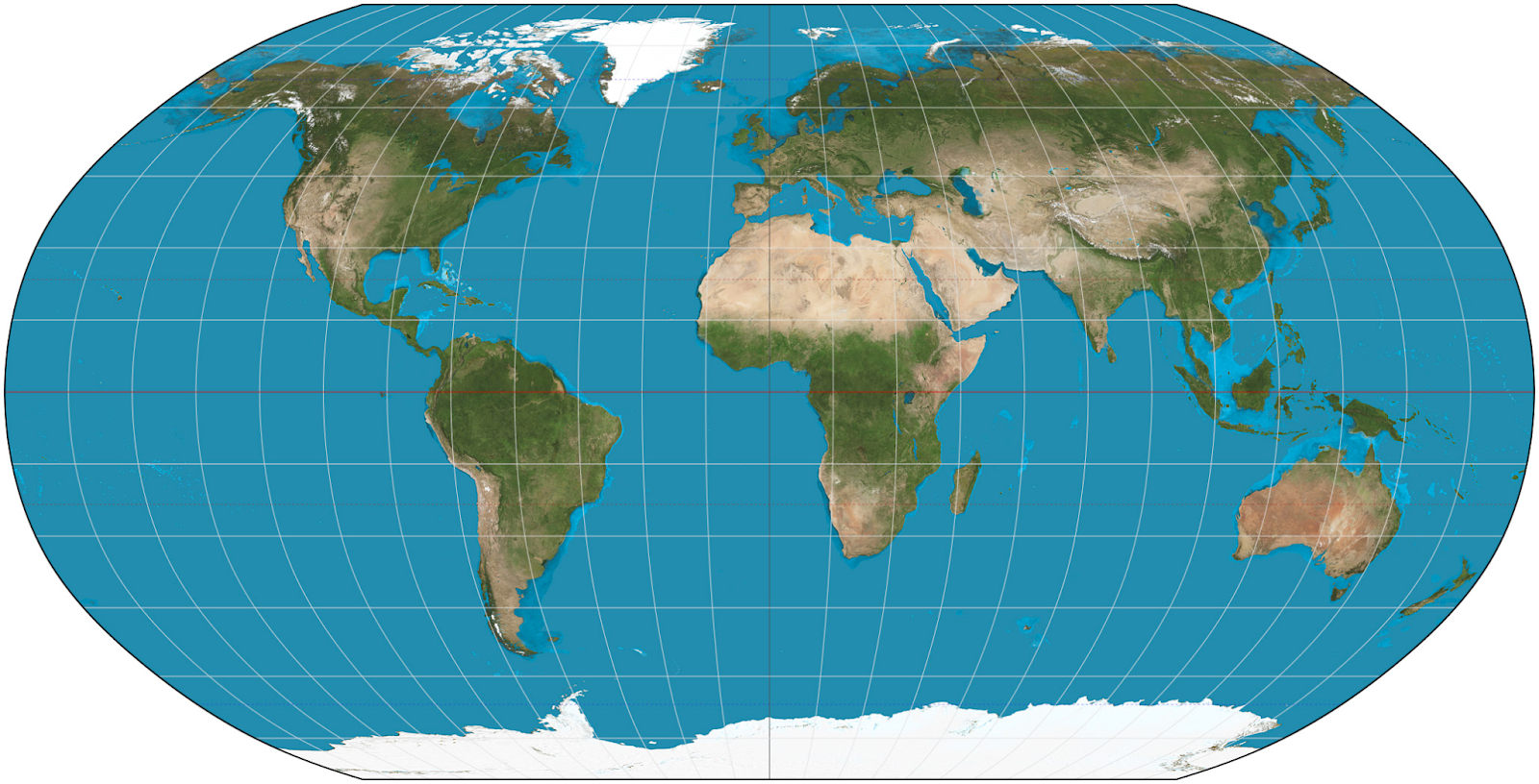
If you’ve ever used google maps, you will already be familiar with the Mercator projection.
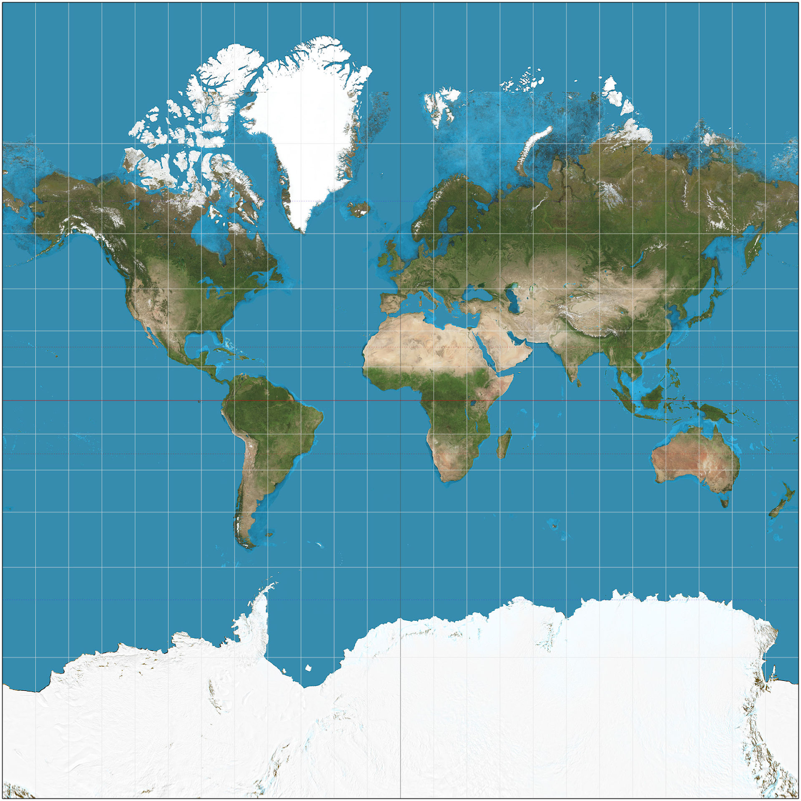
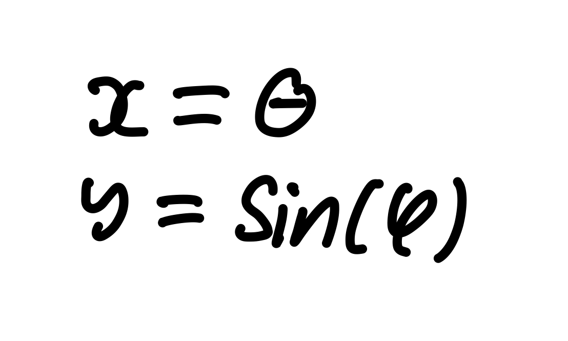
This projection preserves angles, and so distorts areas, particularly those close to the north and south poles. To understand the maths behind this, recall that any point on the globe can be specified by its longitude and latitude:

Then the mercator projection is defined by the formula:
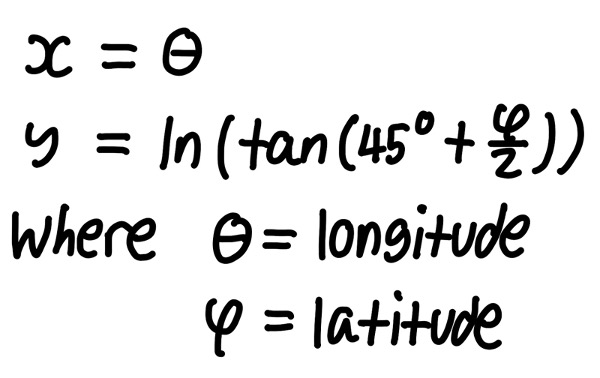
This formula says that the lines of longitude become equally spaced vertical lines, and the lines of latitude become horizontal lines which get more spaced out the closer you get to the poles. In fact, the y coordinate gets infinitely large as you approach the poles, so unless you want to have an infinitely tall map, you have to cut off a portion of the top and bottom of the earth (try finding the poles on google maps!).
This mercator projection was originally designed for marine navigation, because any path of constant bearing is projected as a straight line on the map, however it’s now widely used – the map in your geography classroom at school was almost certainly a mercator projection. The distortion of area near the poles is however problematic – for example Greenland’s area is enlarged by a factor of 14, and depending on how much of the earth you wanted to map, Antarctica’s area would be larger than the entire observable universe.
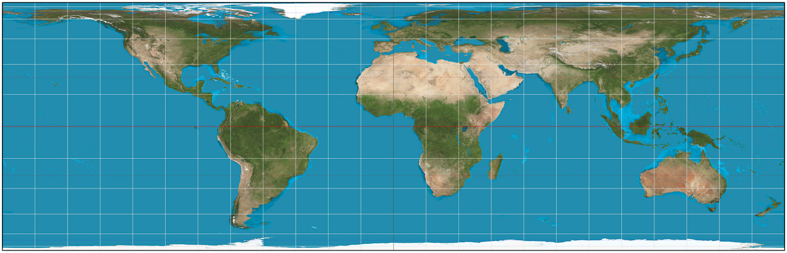
For this reason, some people prefer maps that preserve area at the cost of angles. One such example is the Lambert cylindrical equal-area projection.
This projection also has a more pleasingly simple formula:
At least Greenland is no longer the size of Africa, although it does now look like melted ice cream. Since equal-area projections distort angles and shapes, they’re no use for navigation. However, equal-area projections are great for statistical purposes, for example surveying land area.
What if we don’t care about preserving area or angles, and just want a nice looking map I can hang up on my wall? Well fear not – the Robinson projection is here to save the day!
This projection has no interesting mathematical properties. Seriously. The cartographer Arthur H. Robinson just drew what he thought the sizes and shapes should look like, and then numerically fitted a projection onto it.
I could go on describing every map projection in existence, and while this is tempting, I should probably call it a day soon. So I’ll end with one of the most interesting map projections from a mathematical perspective – Stereographic projection.
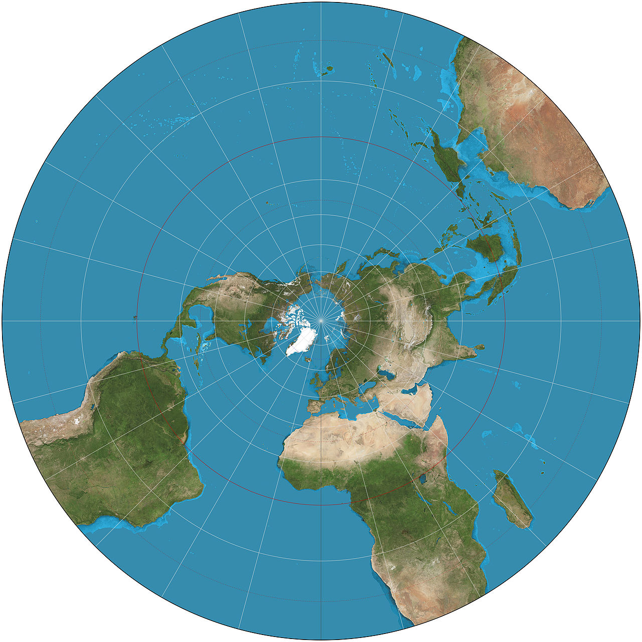
This certainly looks a bit strange in comparison to the other projections we’ve seen, and indeed this projection has, in comparison, little use in geography.
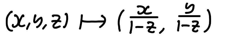
To understand this projection mathematically, we will model the earth as a unit sphere with origin in the centre. Then, a general point P on the sphere can be described in cartesian coordinates as P= (x,y,z), where x2 + y2 + z2 = 1 (we previously used longitudes and latitudes instead). Then under stereographic projection, P is mapped to a new point P’ on the x-y plane, such that P’ lies on the line PN, where N=(0,0,1) is the north pole of the sphere:

Algebraically, we have the following formula for all points (x,y,z) on the sphere:
Except this isn’t quite for all points – the point (0,0,1) is on the sphere, but naively applying the formula would lead to division by zero, which is illegal! So as it stands, all of the sphere except the north pole (think of a punctured beach ball) is mapped to the entire x-y plane under this projection. So where should the north pole go? Since there’s no space left in the x-y plane, we’ll define a new point, called the ‘point at infinity’, which the north pole gets mapped to.
This may well seem very dangerous – we’re taught all the way through school that infinity is not a number, so what are we doing here just adding it into the x-y plane? Well, fear not – all the mathematics we have done here is allowed, and indeed important to many areas of pure maths, with fancy sounding names like ‘projective geometry’ and ‘complex analysis’ (see university/college level maths for more on these topics).
Of course, there’s one easy solution to all this map projection nonsense, and that would be to buy a globe…
