
Philip Kimber – 2021 Teddy Rocks Maths Essay Competition Commended Entry
The surface of a sphere cannot be plotted onto a flat plane without some distortion. This was proved by Gauss in 1827, but has always been the crucial issue for mapmakers and navigators since the dawn of human civilisation.
Nowadays, we might take for granted some of the most ubiquitous maps that aid us in getting around and understanding our world. But cartography and the projecting of the globe is an area of maths that has far-reaching consequences.
To get started, let’s consider a real-world use case of cartography and imagine a ship sailing across the Atlantic from Europe to America.
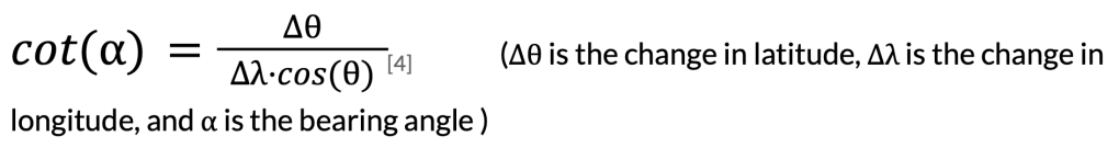
We’ll set sail from Lisbon, and ignoring all winds and currents, travel due west. The question is how far we will travel before arriving near New York.
It’s natural to think of this journey as a straight line, as that’s how we perceive it travelling along and how it might appear on some maps. But considering that the earth is a sphere, the course looks more like this:
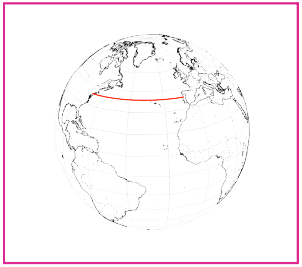
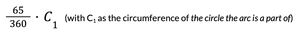
Travelling exactly west, the journey is part of a circle of latitude, making it easy to calculate the distance.
Knowing that the change in longitude across this journey is about 65 degrees, we can calculate the length of the arc, as the following:
This is where we have to consider the latitude. The largest possible circle of latitude on the earth is the equator, where the circumference is the earth’s circumference, and the smallest circles with theoretically zero circumference are at the poles. To work out latitudes in between, we use trigonometry.
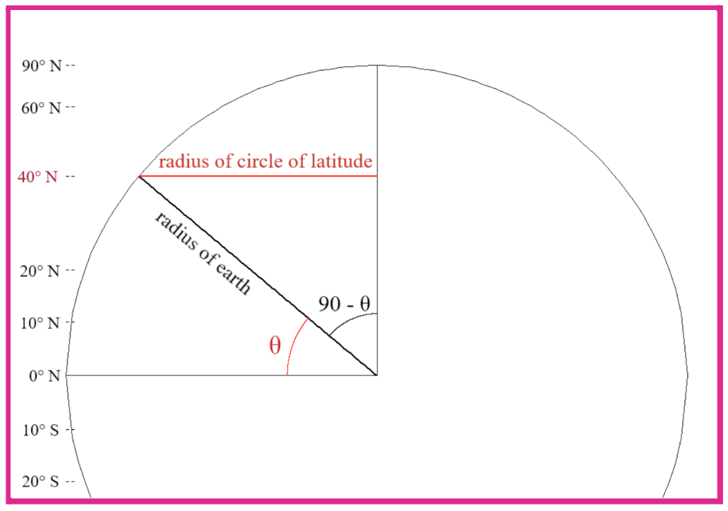
In this diagram, the circle is a cross section of the earth along its axis, so its radius is the earth’s radius. The angle marked θ is the latitude, which then creates a right angle triangle from which we can work out the radius of the circle at that latitude.
The circumference of the circle of latitude at 40°N is C0 cos(θ) so the overall distance is:
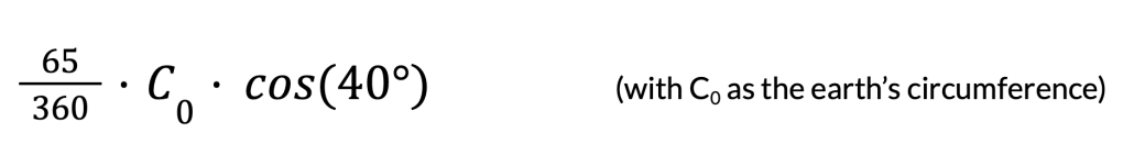
Taking C0 as 25,000 miles, the distance would be about 3,450 miles.
This seems relatively straightforward, mainly because we can easily imagine the course on a sphere. But most of the time we want to plot things like this on a flat map. This requires a projection from the curved space to the Euclidean plane.
Take one of the earliest and simplest projections possible: the ‘plate careé’ projection. Nearly 2000 years old, this projection can map the sphere onto a flat plane in a simple way, and produces a reasonable-looking result.
It takes the coordinates of points and structures on the globe and just plots them linearly as Cartesian coordinates. This simple direct mapping leads some to describe it as ‘unprojected’. But we mustn’t forget that this, like all maps, still distorts the globe.
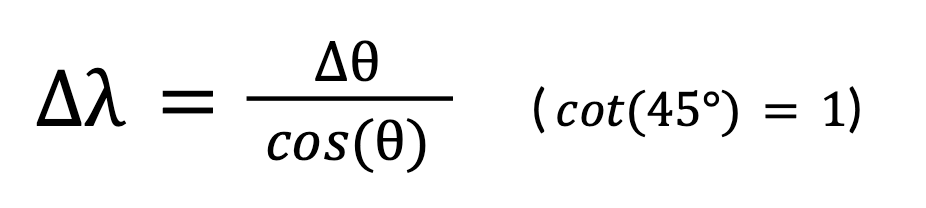
This map shows a bearing of 115° from north, going from just off the coast of Canada, to Australia.
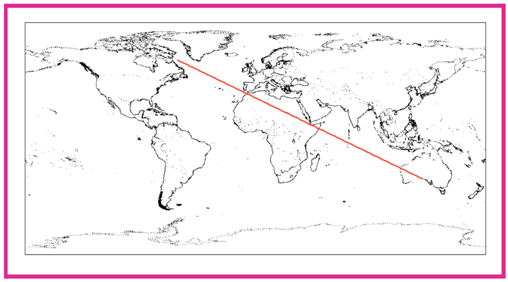
Because the coordinates are just mapped directly onto the flat plane, the line’s gradient is easy to work out – but it is not correct or representative of the real course you would take travelling along this bearing.
Here is a section of that same line plotted onto a representation of a sphere. Not only is it not actually a straight line when we consider how it curves along the earth’s surface, but it does not even take the same path as depicted on the plate careé.
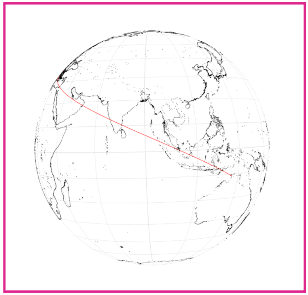
The projected version ends the path over a thousand miles away from where, as we see on the sphere, you would actually end up – on a completely different side of Australia.
Being over a long distance, this could seem like an extreme example, but the truth is that even over short distances, there is nontrivial distortion which causes difficulties for travel and navigation.
This distortion, where straight lines on a map can’t predictably be used to plot a route, was a real problem for navigators and sailors, and was ultimately solved in a number of different ways, each with different side-effects. But to understand this, we need to look at why it is distorted in the first place.
It actually links back to the first thing we considered: the lengths of lines of latitude. When we plot the earth’s surface on a rectangle, all these lines end up parallel and of the same length. This is an effect of ‘cylindrical’ projections, where the earth is (theoretically) put inside a cylinder which is then unrolled.
The equator stays the same length, but every other circle is stretched outwards by a factor that increases as we get closer to the poles. A given change in longitude at 40° north is shorter than the same change in longitude around the equator, and an equivalent journey nearer the north pole would be even shorter. Yet all three would be stretched to the same length on a rectangular map.
The first person to solve part of this problem was Gerardus Mercator, whose 1569 map, known as the ‘Mercator’ projection, is now one of the most well-known. But few appreciate the ingenious mathematics that goes into it.
This is a standard Mercator map, based on the principles of his Nova et Aucta Orbis Terrae Descriptio ad Usum Navigantium Emendate Accommodata published 450 years ago.
The main feature is that straight lines on the map represent lines following a bearing on the globe – these are called ‘loxodromes’ or ‘rhumb lines’.
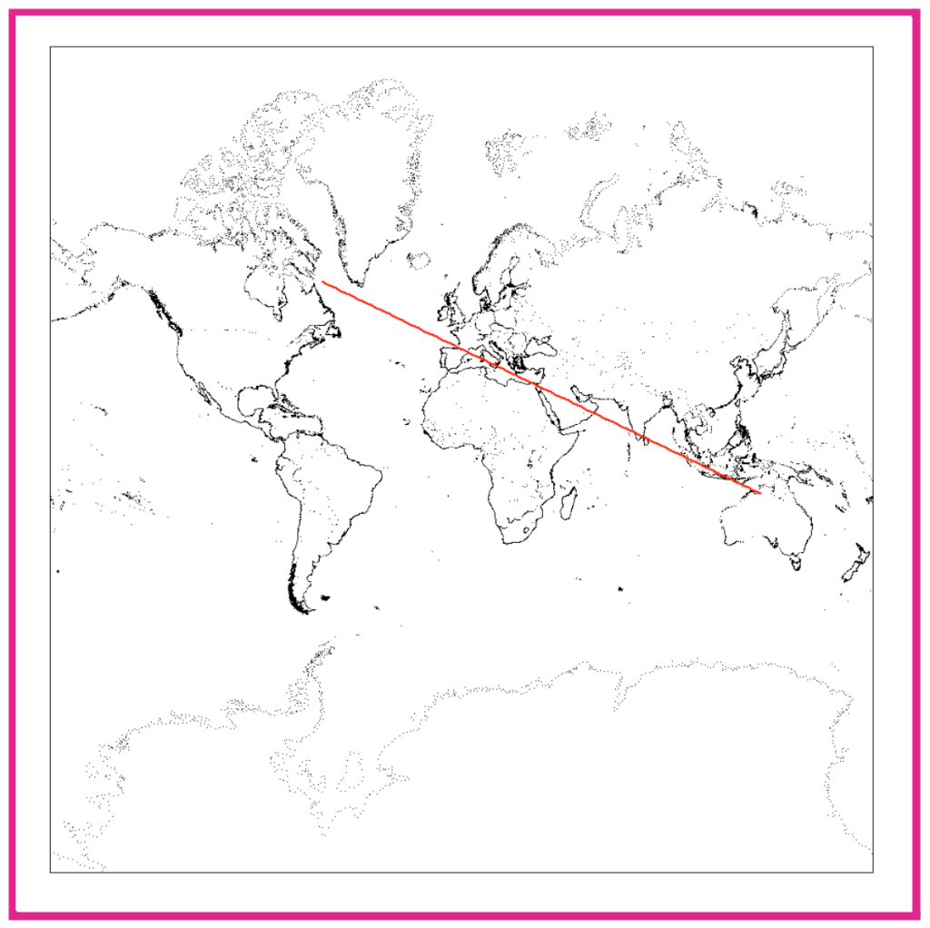
We can see therefore that our bearing of 115° is now plotted accurately and that it follows the course we would expect.
Mercator’s loxodrome to straight line mapping was the crucial element of the map, and what justified its revolutionary presentation: it helped sailors (who travelled on a fixed bearing from north) to plot their course as a straight line.
The actual maths used today to calculate where to plot points on a Mercator map is quite complicated. But we can approximate aspects of it with much simpler calculations – which is indeed how the map was first constructed over a century before the invention of calculus.
Since the original distortion of all rectangular projections is caused by higher latitudes being stretched out sideways, Mercator applied a correction factor to stretch the map upwards as well so that the ‘aspect ratio’ so to speak remained the same.
A way to work this out can then be to take a 45° bearing that goes from the point (0, 0) to the desired latitude. If we can work out the change in longitude along this bearing to get to that latitude, we will know that latitude’s correction factor.
This diagram is an aid to understanding how we might work out where to plot the line of 50° north on a Mercator map.
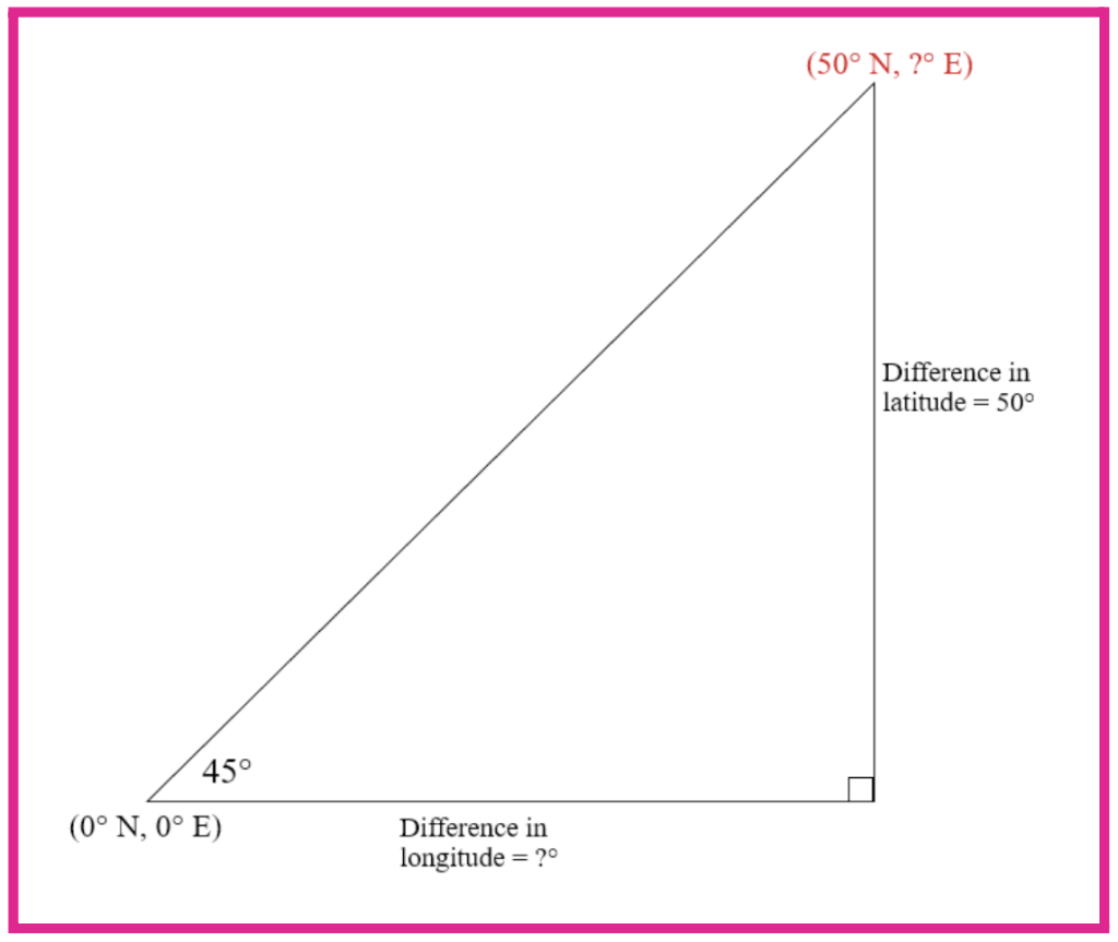
We have specified a bearing of 45° so on the map, the height should be the same as the width.
It might be assumed that the difference in longitude is also 50°, but this is not the case because not all lines of latitude are the same length.
As we know the lines of latitude are of length cos(θ) multiplied by the equator’s length, we can construct a formula for approximating bearing courses as follows:
The issue here is the cos(θ) term as there is no single latitude to measure this at. Therefore the exact solution requires integrating 1/cos(t) with t across the latitude range. But we can still approximate an answer, which is especially accurate at low latitudes.
Specifying a line of gradient 1 and setting α to be 45°, we simplify the above equation to solve the problem posed in the right angle triangle drawing:
Approximating θ as 25° for the denominator, we say that the difference in longitude will be about 55.1°. We know, however, that the line has a gradient of 1 so, as it appears on the map, the line of 50° N should also appear the equivalent of 55.1° away from the equator.
We can make this more accurate by slicing the calculation into a number of smaller sections which we know a more precise value of θ for. When integrating for the exact result, we are theoretically splitting it up into an infinite number of infinitely small sections for full precision.
It’s worth noting at this point that the Mercator projection, whilst a significant breakthrough in the world of cartography, is not perfect – no flat map can be. In particular, its main criticisms surround the fact that it distorts the area of countries.
Since the polar regions are stretched sideways already, and Mercator’s map stretches them upwards to correct for this, their areas are increased quite significantly compared to the equatorial regions. The most famous example is how Greenland appears almost as large as Africa despite being much smaller.
Sadly, of course, this has political consequences, and many since (including historian Arno Peters, contributor to the equal-area ‘Gall-Peters’ projection) have blamed the Mercator map for contributing towards Westerners’ dismissive attitudes towards Africa and South America.
The Mercator projection might be outdated for other reasons as well. Its central feature, plotting constant bearings as straight lines, isn’t necessarily as useful to the modern navigator as it was to sailors of the 16th century.
This is because a constant bearing (rhumb line) is not actually the shortest course between two points on the globe. The quickest way of travelling between two locations, ignoring all environmental factors, is the ‘great circle distance’ – an arc of a so-called ‘great circle’.
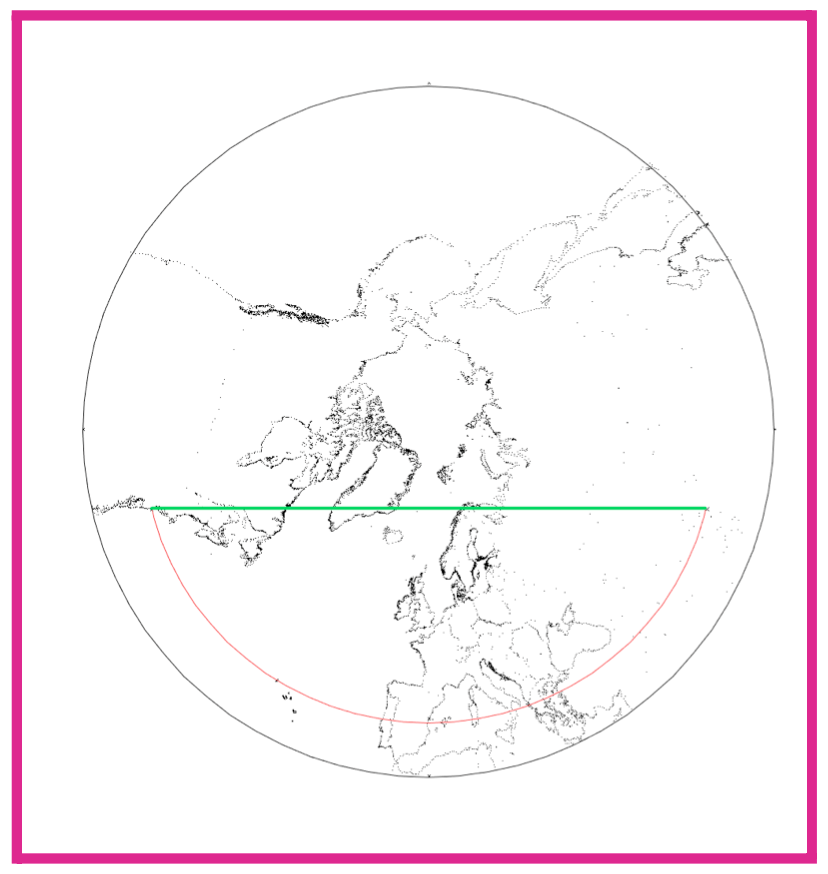
Great circles are circles around the earth with the same radius as the earth, centred on the earth’s centre. Half of a great circle (ie half of the earth’s circumference) is the maximum possible distance between two points on the earth’s surface.
When we look at our original journey over a short distance at the same low latitude, the great circle distance (green) of about 3,350 miles is marginally shorter than our original latitudinal distance of 3,450 miles. But we can see clearly how great circle distance is more efficient when considering flying over the north pole.
Because they don’t follow a constant bearing, great circle arcs appear as curves on the Mercator projection which makes it much harder to use it for navigating with aeroplanes or other transport that usually follows the shortest distance.
But one of the first ever map projections, the ‘gnomonic’ projection developed by the Greek mathematician Thales over 2500 years ago, does preserve great circles as straight lines. A gnomonic projection centred on the north pole can illustrate how great circles are efficient paths.
In practice, the gnomonic projection is rarely used for normal purposes because it shows only a fraction of the earth’s surface and has unworkable distortion. But like all projections, it shows a unique view of the world.
Since Thales, mapmakers have been devising new ways of plotting the globe onto a flat plane. Some have become widely used, and others have remained thought experiments. But all have been examples of where mathematics can shape our world.
References
[1] https://en.wikipedia.org/wiki/Equirectangular_projection
[2] https://pubs.usgs.gov/pp/1453/report.pdf p116, p218
[3] https://www.math.ubc.ca/~israel/m103/mercator/mercator.html
[4] https://www.maths.usyd.edu.au/u/daners/publ/abstracts/mercator/mercator.pdf p4
[5] https://en.wikipedia.org/wiki/Great_circle
All maps and globes plotted with R, using coastline and country border points from https://gadm.org/

[…] Philip Kimber ‘Maps and Projections’ […]
LikeLike